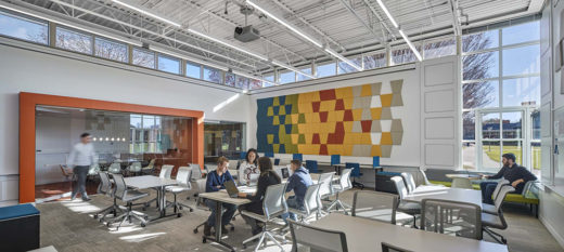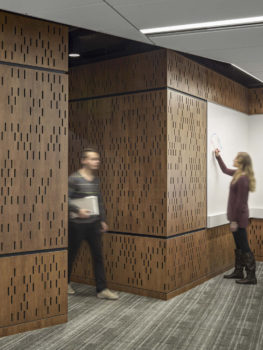
Lender School of Business at Quinnipiac University in Hamden, Conn. Designed by Amenta Emma Architects. Photo by Robert Benson Photography.
The brand of a college or university is more than its logo or tagline. It’s an accumulation of experiences for students, staff, faculty, alumni and community members. Marketing is part of it, but every time someone sets foot on your campus, they are walking into your brand.
This fall, fewer students will be on campuses and they may be there with less frequency. COVID-19 won’t last forever, but in a way, this year is a glimpse into the online learning future that was coming with or without a pandemic. It’s more important than ever that the physical campus foster in students a strong affinity for the school to keep enrollment, retention and alumni engagement numbers high. Without a deep connection to the physical place, students may fall into a commoditized mentality, enrolling in online courses where the prices are lowest and not thinking of themselves as an Owl, Bobcat or Camel.
There are four areas on a campus that can be designed or used in expressing the institution’s brand: interior spaces, buildings, outdoor spaces and the environment surrounding the campus. Below are one or more well-executed examples from each category, one of which I was involved in directly.
Walking inside your values

Lender School of Business at Quinnipiac University. Photo by Robert Benson Photography.
One way to more affordably and quickly align the brand of a particular college or program with its physical space is to work within the walls you already have. My team at Amenta Emma Architects and I recently redesigned the interior of the Lender School of Business at Quinnipiac University to bring it in line with the school’s refocused identity.
With a glass dome against the backdrop of Sleeping Giant State Park, the exterior is an iconic part of the university’s brand. However, the interior, with muted colors and dim lighting, hailed from a Wall Street era of student aspirations and university curriculum. As with many business schools, there has been a shift in emphasis toward innovation and entrepreneurship, and the interior of the Lender School of Business had yet to catch up. The goal of our update was not just to reset the tone to reflect the work being done there currently, but also to change student expectations about the qualities they will be developing in themselves in this space.
The transformation utilized exposed ceilings, light colors and transparent materials to energize the programming. Colors and furniture play a central role in creating an impression that is contemporary in the App Development Center. The Financial Trading Center was given a refresh by way of accent colors and lighter colors on the ceiling to create a brighter space. To accommodate a change in pedagogy toward active learning, three small, traditional classrooms were converted to two collaborative classrooms with technology integrated into custom furniture and reconfigurable writing surfaces. The school’s history meets its future in wood wall panels with a cutout pattern that creates a “digital” impression that’s at once warm and forward-looking.
Start with words, then build from there
In our redesign of the interior of the Lender School of Business, words like “innovation,” “entrepreneurship” and “collaboration” fueled the process. When colleges and universities begin thinking about adding or replacing buildings on campus, I recommend that they start with words.
While it’s tempting to begin picturing the actual building (“It should be three stories and we want lots of glass,” or something similar) start by asking how the building relates to your institutional values and mission. What does it need to say or express about the university or a particular college? How should the space feel? When students approach the building and enter it, what words should describe their first impression? What will students feel empowered to do in this space?
When I think of a university using a campus building to differentiate itself, I go all the way back to 1826. That’s the year the University of Virginia (UVA) completed construction of the Rotunda at the head of its lawn. It’s a beautiful building, but what makes it unique isn’t so much its appearance, but the simple fact that it houses a library as the focal point of the quad, where other campuses may position a student center or church. UVA describes the Rotunda as the “architectural and academic heart of the university’s community of scholars,” and from day one, that’s the word it has embodied: scholarship.

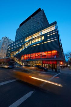
University Center at the New School in New York City. Used with permission.
For a more recent example, look to the University Center at the New School. Transparent, crystalline stairwells are exposed to the Manhattan streets and a sign set against a red background inside the building and visible through windows seems to suggest, “Things are different and exciting here.” This overtly contemporary building reflects the school’s dedication to academic freedom and intellectual inquiry and telegraphs that this is a home for progressive thinkers.
Living out your campus identity
The Low Steps and Plaza at Columbia University are remarkable for the variety of activities that take place there. This plaza hosts open markets, concerts and the occasional demonstration. Located in the center of campus, it is a natural gathering place for students, faculty, staff and alumni and is infused with history and campus culture.
Not every campus has a Low Plaza or Harvard Yard, but most have an outdoor space which can be leveraged to promote community and a shared sense of identity. Central outdoor spaces often focus on a particular element—such as a bridge, clock or statue. It can even be a big rock if that says something about who you are. Embellishments such as paving, planting, furniture, lighting and graphics can create central spaces on campus in areas that may be lacking or underused. Repeating these elements on multiple campuses can unify the brand message within an institution that spans many locations within a city or even around the world.

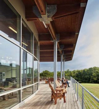
Middlesex Community College Dining Pavilion in Middletown, Conn. Designed by Amenta Emma Architects. Photo by Robert Benson Photography.
These spaces come to life when students feel empowered to make them their own through scheduled events as well as impromptu activities. You don’t always need a big plaza-type formal space; something as simple as a porch with moveable chairs can be a welcome contrast to all of the restrictions students have to contend with right now due to COVID-19. With the design of the Middlesex Community College Dining Pavilion in Middletown, Conn., Amenta Emma aimed to create a campus living room. Adirondack chairs and picnic tables line a protected porch overlooking a large lawn banked by forest. The space reflects the open character of the college with community members, students, faculty and staff using it for events, meetings or individual study.
Inviting environs
The brand experience of a campus doesn’t begin and end with the property line. Views and surroundings shape the brand as well. Savvy institutions lean on their environs as a differentiator.

College of the Atlantic in Bar Harbor, Maine. Used with permission.
The homepage of the website for College of the Atlantic in Bar Harbor, Maine, doesn’t show the campus. Online visitors are greeted with images of the countryside and the water. The campus has some iconic and historic architecture, but the institution recognizes that its identity and brand are explicitly tied to the unique location. The college focuses on the relationship between humans and the environment. By underscoring that nature is part of its campus, College of the Atlantic aims to attract students who are a good fit for its programs.
In stark contrast to College of the Atlantic is New York University (NYU), a campus whose buildings are woven into the fabric of the city. It makes a statement about its brand and the type of student experience it offers simply with its location. For colleges and universities without an obvious natural or urban asset in their surroundings, simply being aware of lines of sight and making sure air conditioners don’t obscure a pleasant view, for instance, can enhance the experience of being on campus.
Unmasking your culture
This year, as administrators look for creative ways to foster a sense of community that may be eroded in the wake of the pandemic and associated social distancing, it may seem like the campus you have is the campus you have. That’s not necessarily the case. Here are a few short-term ideas on how New England colleges and universities can leverage their brands this fall to make sure the campus still feels like home for students.
Our research has shown that students like to see their own faces and those of their peers in imagery associated with their college. Since your students’ faces likely will be obscured by masks while on campus this year, why not make use of otherwise blank spaces in hallways or building exteriors to hang large wall graphics or banners showing the student experience and featuring real, current students?
The pandemic, and its focus on avoiding crowded, indoor spaces, provides something of a license to make unusual use of outdoor spaces. Can aspects of student life or academics move outside? Are there spaces where additional seating can be added to encourage outdoor studying or eating? Could something dramatic with landscaping be done this year that is new, facilitates additional outdoor activities, and celebrates the school culture? Can you add more outdoor programming in the winter months with heaters, bonfires or events that make use of snow?
While use of school colors and logos on campus can be effective in moderation, difficult times like these call for a greater show of unity, which can be temporary. Boldly repainting interior and exterior spaces in school colors can always be undone if it seems over-the-top when the masks come off.
Trying as this academic year is going to be, there’s no better time to sharpen your institution’s brand and explore how it can be expressed on your campus in the long and short term. This year has truly tested what it means to be a student and an institution of higher education. The fact that colleges and universities need a strong value proposition to retain students on the physical campus has never been clearer.
Michael Tyre is a principal at Amenta Emma Architects with offices in Hartford, Boston and New York City.
Related Posts:
Landscape Measure: Animating the University Campus to Promote Social Distancing
Four Dimensions of Brand-Focused Research
For Universities, Living Smaller is Living Better
Another Brick in the Wall? Increased Challenges Face the Physical Campus
Summer 2002 Journal: Issues in Campus Architecture
[ssba]
